I've framed the initial 3D character concepts I made and they will hopefully be displayed by Wednesday. They will be displayed at Birmingham Institute of Art and Design near the Vis Com office! Check it out if you're about!
Monday, 27 February 2012
Thursday, 23 February 2012
Circus Characters So Far!
So the past two days I've really concentrated on my children's book idea. Here are the characters I have designed so far..I'm rather chuffed with them actually! There's probably not a lot I will change when I get round to producing the finished book; just neat them up and alter positions if needed! I hope I've communicated the personality of the characters..any feedback is welcome :)
Wednesday, 22 February 2012
Vaudeville Update: Character Design
Possibly my favourite character to date! I had loads of fun creating him and think he will look great on the poster design I have in mind.
Tuesday, 21 February 2012
Sunday, 19 February 2012
Collaborative Project: Salem Church
Anyway..I've been asked to produce a poster and flyers to advertise a potential event at the venue to help back up the design. I'm in love with this era of entertainment and victorian advertising so the posters will be heavily influenced by this. As I love to work in 3D, my initial idea is to create a piece that looks similar to victorian puppet theatres:
Here are my rough sketches!
Very excited about this project!
Tuesday, 14 February 2012
YCN: Idea Development
I decided to change the words on this design...I'm not sure whether it looks right so will await feedback! I also created a mock up of how it might look as an A4 tent card:
YCN: Introducing Type
Just experimenting with a simple background and type. I really like the idea of using these retro fonts to compliment the image..not sure about all the sparkles! Might take some out as I feel it slightly alters the legibility of it..?
Monday, 13 February 2012
YCN - Triumph
I've just started working on the YCN brief set by Triumph; to design a piece of communication that promotes their bra fitting service. I'm actually loving this brief!
This is just a quick mess around with an initial idea for imagery..
Triumph seem to really pride themselves on the history of their company so I'd like to show quite a retro look to the work..
I'm going to have a play around with other characters that communicate the different products they offer - not just the kinky stuff! - but the practical casual products too..
These characters are inspired by the benefits of having a bra fitting, this one is;
"Improve your overall body shape"
More updates to follow!
Don't forget to like me on Facebook:
or follow me on Twitter:
Sunday, 12 February 2012
More Editorial Practice
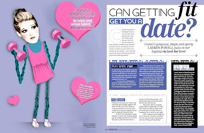
More editorial practice using an article from Cosmopolitan magazine, found at http://
Editorial Practice
Just a quick editorial practice using a previously published article. Felt like I'd lost my groove! So this is just to get me in the zone again :)
Article found at www.bumpitupstyle.com
Tuesday, 7 February 2012
Developments
Current state of my Black Swan editorial after undergoing a few changes and tweaks:
Think I might experiment with backgrounds a bit more..
Black Swan
This brief is a nightmare! I already posted an illustration I did for this, but after checking out some of the competition they all looked extremely similar, so I wanted to try and come up with something more conceptual for it. Today has been stressful :'( I've had a few strong ideas, but when it came to executing it, it was a struggle to do a decent job and make it fit on the page as the magazine is a really awkward size!! It's a real shame because I was excited about doing this idea and now I just want to get the brief over with!
Anyway, I've started messing around with a different idea but I'm not sure how far it will go. I'm finding this really difficult as the cover requires a "portrait" of the main character and I'm definitely not used to working like this...waaaaaaaah! :'(
So far..
I was looking a Dadaism so it's mostly influenced by that..the white swan's body is made up of quotes from the film and the black swan's body is the sheet music for Swan Lake and that's about as deep as it goes..it's really rough and shit at the moment but hopefully it'll develop and I'll get something decent out of it..
Now time for a filthy pizza to cheer me up, diets are for losers :(
Subscribe to:
Comments (Atom)
Followers
About Me

- Chloe
- Hi my name is Chloe, 21, currently based in Birmingham and studying Illustration at Birmingham Institute of Art and Design.


